
Mobile devices have completely changed the way people browse the internet. From searching for services to making purchasing decisions, smartphones have become the primary tool for online interaction. If your website isn’t mobile-friendly, you could be losing potential customers every day without realizing it.
A mobile-friendly website ensures that users can easily browse, read, and interact with your content on any device. For growing businesses, this is no longer optional — it’s essential.
Mobile Traffic Continues to Grow
The majority of website visitors now come from mobile devices. People expect websites to load quickly and adjust smoothly to smaller screens. If your site requires zooming, scrolling sideways, or waiting too long to load, users are likely to leave.
A responsive website adapts automatically to different screen sizes, providing a better experience for every visitor.

Mobile Optimization Improves Search Visibility
Search engines prioritize mobile-friendly websites because they want to deliver the best possible experience to users. If your site is not optimized for mobile, it may rank lower in search results, which directly reduces your visibility and organic traffic.
A mobile-friendly website helps improve SEO performance by ensuring fast load times, responsive layouts, and easy navigation. When search engines see that users spend more time on your site and interact positively with it, your rankings improve.
Better Mobile Experience Leads to Higher Conversions
Mobile users often take quick, action-driven steps — such as calling a business, filling out a contact form, or making a purchase. If your website makes these actions simple and accessible, you significantly increase your chances of converting visitors into customers.
Clear call-to-action buttons, straightforward navigation, and easy-to-use forms remove friction from the user journey. When users don’t have to struggle to find information or complete tasks, they’re more likely to take action.

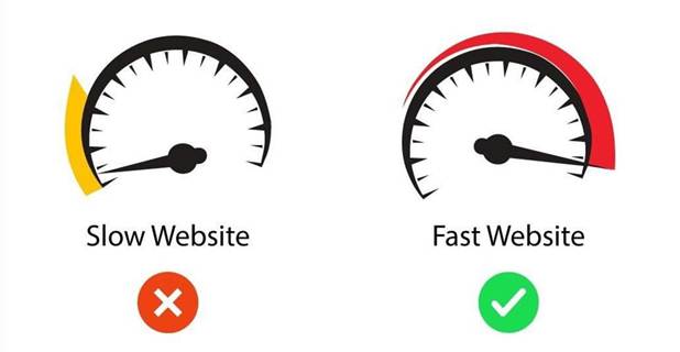
Speed Is Critical on Mobile
Mobile users expect instant results. Slow-loading websites quickly lead to frustration and high bounce rates, especially on mobile networks. If a page takes too long to load, users will often leave and move on to a competitor’s site.
Optimizing images, minimizing unnecessary code, and using reliable hosting can dramatically improve mobile performance. Speed is not just a technical factor — it directly impacts trust, engagement, and conversions.
Mobile-Friendly Design Builds Trust
A website that works seamlessly on mobile devices sends a strong message about your brand. It shows that your business is modern, professional, and focused on user convenience. When visitors can easily navigate your site on their phones, they feel more confident interacting with your brand.
Trust grows when users experience consistency across devices. A positive mobile experience increases the likelihood that visitors will return, share your website, or recommend your business to others. In many cases, mobile usability can be the deciding factor between choosing you or a competitor.
Staying Competitive in a Mobile-First World
Your competitors are likely already investing in mobile optimization. Businesses that fail to adapt risk falling behind in both visibility and customer engagement. A mobile-friendly website helps you stay competitive by meeting current user expectations and industry standards.
As mobile usage continues to increase, having a responsive website also prepares your business for future growth. Investing in mobile optimization today ensures your website remains relevant, effective, and competitive in the years ahead.
Better Analytics and User Insights
Mobile-optimized websites make it easier to track user behavior and analyze performance. Understanding how mobile users interact with your site helps you identify areas for improvement, such as page layout, content placement, and call-to-action effectiveness.
These insights allow you to refine your website over time, improving user experience and conversion rates. Data-driven improvements ensure that your website continues to support your business goals and deliver measurable results.

Final Thoughts
A mobile-friendly website is essential for reaching more customers, improving search rankings, and growing your business. It creates better experiences, builds trust, and drives real results.
Ready to make your website mobile-friendly?
At Experts Bay, we design mobile-responsive websites that perform beautifully across all devices and help businesses grow faster.
Contact Experts Bay today and let’s build a site that works everywhere.
📧 Email: info@expertsbay.com
🌐 Website: www.expertsbay.com
Let’s build a web site that works for your business — not just looks good.